Showing posts with label design. Show all posts

Thursday, July 19, 2018

Organic Chemisty - Fabric Design


It's crazy how long I've been away from blogging and, to be honest, even creating much. But I'm finally getting back into things and one of the things I am trying to do is fabric designs for Spoonflower's Design Challenges, as a good way to regularly create and practice.


This one is for the "Circles and the New Triangles" challenge, which is a strange name for a topic but opened a lot of possibilities for designs. I did some research and doodling and came up with this geometric design, meant to be made of hexagons and triangles but give the impression of circles (or at least roundness) because of the colouring and pattern. Plus there are little circles connecting all the lines. It took ages to make all the little lines since I was doing them at random, but I really love how the colour turned out on this and am very happy with it overall. I named it after the hexagon pattern and because the randomness of the lines feel more 'organic' than strictly computer-made geometric lines.


Head over to Spoonflower to vote in the contest or buy this pattern (it comes in wallpaper and giftwrap too!).

Sunday, January 15, 2012

Angry (snow)Birds


I enjoyed my last Angry Birds t-shirt design, and decided that the cute little Snowbird needed it's own design I love how it turned out! So, go buy one right away.

Saturday, January 14, 2012

RCAF Birds

I put this new t-shirt design up on Red Bubble. It's based on the game Angry Birds, but I made all the birds look like different RCAF aircraft. The idea for this came from the patch I'm designing for the nav course I just started. We wear a course patch on our left shoulder of our flight suits, which we (and that'll mean me) choose and design. We were talking about doing an Angry Birds theme, and I said I would make one that looks like a Dash 8, because that's what we fly in for training. It went well, and now we just need a motto before we can get them made. I enjoyed doing it so much I decided to make a few more, and see what kind of design I could come up with.

This is the first version of the planes I came up with. They're based on (left to right) a Polaris, Hercules, Aurora, Cormorant, Tutor, Sea King, and F-18. I tried to choose different types of aircraft used for different purposes. to have a good variety. I couldn't do one of everything because I was limited by the number of birds, and it just would have gotten to be way too many planes to make into a nice design. I decided it would be nicer to limit the numbers and do something cool to the layout instead.

Some of the plane/bird pairings I choose because they went really well together for more than just shape. The Polaris is used for air-to-air refuelling, so the bird that lays eggs was a good match. In the final design I used a trail of little clouds, similar the the ones the game uses to show the path the birds take in the game, to 'connect' it to the F-18.

The Cormorant is used for Search and Rescue, so it's painted yellow and red, and it's similar in shape (or as close as you can get in a game made of geometric birds attacking pigs) to the triangle.

The Tutors are the small planes used by the Snowbird acrobatic team. The little blue bird that splits into three was perfect for that. They're my favourite.

The Sea King is based on the exploding bird, which I kind of thought was funny because they are so old and we always joke about their state of repair. I originally had the explosion from the game behind there, but I though it was too close, in regards to copyright, and figured it would be a good place to put the RCAF rondelle. I used the yellows from the Cormorant, and the vintage maple leaf to get get a bit of the 'explosion' feel.

Wednesday, September 14, 2011

A Career Change? or The Art of Everyday Life

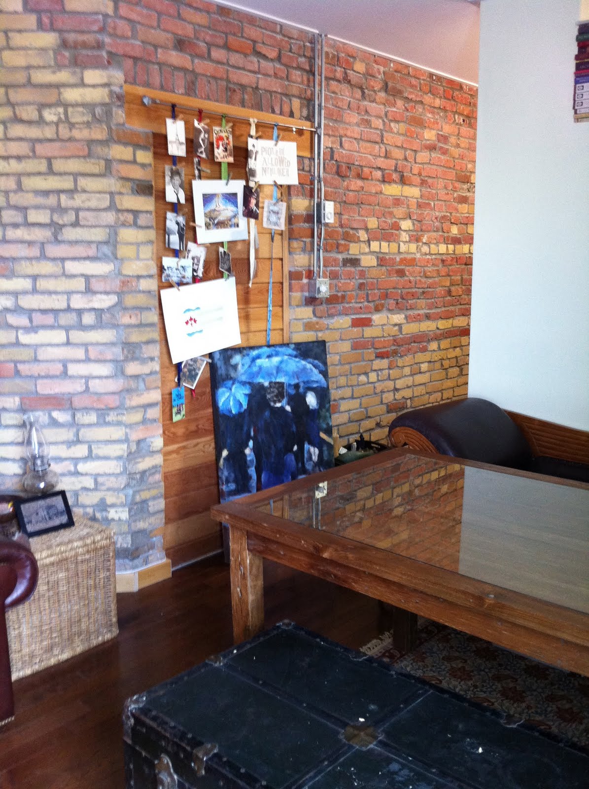
Once upon a time I wondered what I should do with my art degree, and one of the things I looked into (or googled, at any rate), was interior design. It would have required a whole lot more school, so I left that idea behind, but I really do love putting my home together. Here are a few shots of my new, obviously owned by an artist, condo.

Although the bedroom is separate from the rest of the place, it's nevertheless still technically a
 bachelor, and therefore severely lacking in storage. It doesn't have a closet, so I made this shelving unit to show off the clothes I wish I got to wear more often. After all, they're lovely, and this way I make them into an art display.


This table was custom made in Indonesia from an old temple door. It seats six easily, and eight fairly comfortably.  As I love having people over, and figure on usually owning a small space I wanted multi-purpose extensions for it. The end tables in the previous, bedroom, photo are those extensions. They're the same height and width as the table, and can fit a person on either end (albeit a fairly slim one), meaning I can feed twelve people should I take it into my head to do so, but at all other times have two separate and functional pieces of furniture.

 I have a token brick wall, because I am apparently a yuppie. I love my postcard/random art collection. They're just clothpinned to ribbon, so I can change up that display whenever I want. I love that painting but I'm starting to feel I should try to store it somewhere, despite it's size, because there's already quite a bit going on.

The lack of storage led to these shelves,  which are actually old door frames (the top bit), from a local place that specializes in stuff from, and to restore old homes. I was planning on using them as a base for a shelf, but they're actually wide enough to display things as is.

That red man is actually a knife block. I traded a drawing for it. That little ledge/laptop/stool area is my studio.

Saturday, July 2, 2011

ACSO patches


I'm stuck waiting for training to be an ACSO (Air Combat Systems Officer) in the CF, and therefore have a naked flight suit without any proper badges. However, they're going to be changing that soon, when we get an ACSO In Training patch! Or it's rumoured, at any rate, that they're going to hold a contest to design one. Which is good enough for me to start playing around with a few ideas on a lovely Saturday morning. The top one is my favourite, it's based on the t-shirt design I did for my platoon at basic.I finally fixed her head by tilting it back a little, which had always annoyed me. She's sitting on top of the ACSO (formerly Navigator) symbol, that we'll someday have on our wings. I used the same background and rivets as the t-shirt, keeping with the idea of 'nose art' as the inspiration. The phrase at the bottom is a play on the air force motto "Per Ardua Ad Astra" (Through Adversity to the Stars), changed to "Through Coffee to the Stars" because the running joke is, that, as we are just in make-work positions until our course starts, we do nothing but make other people coffee.


This patch is a bit of a joke based on the coffee idea. I took the Navigator wings and replaced them with a coffee pot, and the Star Wars reference is because 2LTs (Second Lieutenants, our rank until we're qualified) tend to get tasked to do all the crappy jobs no one else will.

Thursday, June 23, 2011

Officer's Mess Coin

The Officer's Mess here at CFB Winnipeg voted to give out special coins to departing members who have been here over a year. I believe most messes do this, and there are lots of nice examples of designs available. They are having a contest (I think they only got two entries though!) and this is my contribution. It's a vintage maple leaf on the left and a stylized plane on the right, in two shades of blue (what else? It's a good thing I like Air Force Blue because there's nothing else around). In the plane is a simplified map of downtown Winnipeg, focusing on Portage and Main, of course. The yellow parts would be in metal, and the colours in enamel or whatever it is they make them out of.

Tuesday, June 21, 2011

Variations on a Theme: Butterflies

I posted this design on my last blog entry, and today I worked on two designs based on it for a contest at Spoonflower. The theme was butterflies and it was limited to six colours, which they specified. This is what I did with the above design, given the parameters for the contest.


I'm not even sure I like the colours they choose, but I'm fairly happy with what I did with them. I entered the bottom design. I hope that was the right choice! I'll sure sure to let you know when voting starts so you can help me win!

Monday, June 20, 2011

Butterflies, Dandelions, and Steampunk Paisley: Fabric Designs

Sometime last year I joined Spoonflower, a neat site that allows people to uploads and print custom fabric. They also have contest every few weeks on different themes, which I enjoyed the challenge of designing for. For about three weeks until I got interested in something else... I've finally made some new designs, and a couple of variations on an older one, and because they're offering free shipping until tomorrow morning I broke down and ordered some samples. They come in 8"x8", and I have to order them before the designs can go on sale (quite the racket!) but I want to see them in person and I think it will be really neat to use fabric I designed myself to make spines for books.


Friday, June 10, 2011

T-shirt designs: Zeppelin rides.


I spent the last couple of days working on this t-shirt for no particular reason other than to try it out. For the non-geeks out there it's based on the sci-fi trope that parallel universes always seem to have zeppelins. This was a fun project because I got to pull out my Retro Graphics book and mimic art deco travel posters, which I love. It was also a way for me to experiment with vectors in Photoshop, which I'm finally getting a hang of. I also enjoyed having to limit my colour palette to six colours (for printing), which made me get creative with the design, and learn to do halftones for the gradients. I think this would be kind of cool on an orange shirt, which is why it's pictured on that background, but there are probably a lot of colours that would work well. Now to find a good place to publish this!

Wednesday, June 1, 2011

Rock From the Inside Out, a new t-shirt idea

I've been working on this design for a couple of weeks now. I was playing around with the idea of doing something with anatomy, and got the idea of playing around with traditional, rockabilly style tattoos to mimic the shape of the organs. I think it turned out very well. Now the only thing I have to do is decide what goes in the banner. I think this would made a great band t-shirt, but since I'm not really familiar with anyone needing one, so I have to come up with something else. It'll probably just be 'Rock n Roll' but if anyone has a good idea, please let me know!

Tuesday, May 17, 2011

Nijmegen T-shirt Design

This is a t shirt design I did for the Nijmegen team at CFB Winnipeg. The team is training for a four day march in Nijmegen in the Netherlands, and will be doing 40km per day, totalling 160 km. I had to drop out of the trainnig because of scheduling conflicts unfortunately, but I'm still working on the design (mostly so I can get a shirt!). Check out the March's website for more information.

Canada has been participating in the March since 1953, so I wanted a vintage feel for the design. I started with the old RCAF crest and manipulated the orientation and banner, and changed the wording to reflect the occasion. I took the maple leaves that were around the roundel and alternated them with tulips to represent the Netherlands, and after that drew in all the swirls, which are loaded with more maple leaves and tulips. I used the wartime crest with George's crown to keep with the vintage feel, but we're switching it to Elizabeth's for the final print.

I'm going to find somewhere to print it now, in white ink on Air Force Blue or maybe brown.

Saturday, November 27, 2010

But how are you going to make things?

When I was leaving for basic training one of the questions I kept getting was "What about your art?" And it turns out that I did get a big opportunity to make pretty things. I designed our platoon t-shirt, and I have to say the results are pretty much awesome. Usually these things just have the platoon number on them, and maybe the school's logo, but we're going all out here!

The design is based on 'nose art' (paintings on the front of planes) we saw at the Canadian War Museum, which you should all visit if you're ever in Ottawa. About two-thirds of my platoon is air force (myself included), so it's appropriate. We have very little navy, so they only get the tattoo on the army girl. The saying is something our instructors say frequently that we've picked up on. They're mainly Francophone, so the spelling is supposed to pick up on their accent. The maple leafs with the bombs were taken directly from one of the pieces on exhibit. It was how the crew had marked their hits. It was a pretty cool design, so I used it and added the ranks of our instructors to them. Then I made it look vintage in Photoshop, and we're good to go!


Monday, February 15, 2010

That's Not a Book!


I do, in fact, make things other than books. And I found a contest to design steampunk fabric and got a little obsessed. Moderation is not something I do well, I'm either extremely passionate or don't bother. And this piqued by interest, especially since I'd been thinking about a design of this type to embroider anyway, I had a great idea, and then of course got very ambitious.

It's complicated to do a repeating pattern that intersects at so many points and needs to be an interesting design when repeated. It took hours just to figure that out, and many many more to make all the little circle designs in this.

The design is based on Romanesque swirls, damask patterns, paisley, and of course, some steampunk Victorian stuff thrown in. All the little circles were where I decided to add the industrial feel. I wanted them to look sort of gear-like, but not be gears. I don't like how most steampunk stuff is just a bunch of useless gears stuck on top of things that don't actually have moving parts. And as a disclaimer I should say that I love gears. I freaking love gears and watches, I adore skeleton watches or open case-back watches where you can see the movement working, because then there's an actual point to them. I mean my to-do list when I win the lottery is basically my watch wishlist (and I work in a swanky jewellery store so I know my watches), Habs season tickets, and a loft in Vancouver. Probably in that order. But let's keep the gears where they belong and try to move beyond something quite so clichéd, eh?

Anyway, I'm sure the voting will start soon enough, so check it out on the spoonflower blog.