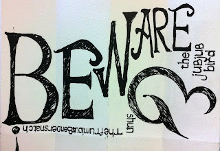
I've been playing around with what the text would look like for Jabberwocky, and here are a couple of the thumbnails I've come up with. I experimented with the size, spacing, and font in the red picture. I want the strangeness of mixing up font elements, but I'm also going to orient the words strangely: upside-down, sideways etc. I want to keep the letters packed in like that, and may even remove the spacing between words, because it makes the text look more like a design element and, again, makes it stranger.
I'm going to work in a couple spots where the text is in negative as well. The black areas, including the dense text, will contrast in the final book with the parts that have no or little writing, especially given the maze book shape I've chosen.
I've made a three mini books on scrap paper to work out the layout. It looks pretty cool when it's all folded up!
A photo of the other side of the book. I like it a little better with less colour, so I may cut down on the amount of Jabberwock illustrating the pages, or maybe use less colour (I have it in yellow and green right now).
This is the layout when it's not folded up. I accidentally grabbed an orange pencil instead of red, but it looks OK anyway. That's going to be a stand-out panel with 'O frabjous day' on it.
From the other side. The blanks are where the last verse, the repeat of the first will be. I am actually going to reuse the lino cut from the first verse because the layout works a second time, which is a piece of good favour I'm going to take full advantage of.. I'm just too lazy to draw it twice.
Logistics:
Between the additional research from the last post, and all these drawings, I've done about 9 more hours on this book.


