Saturday, December 31, 2011

Books Reduction Lino Print - Oranges

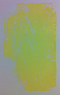
The first colours of this print are all the highlights for the final product, so they are looking very very neon right now! The first is an orange that will (should, anyway) add the nice gold tones of the books:


Then comes a red-orange for a few more highlights. This colour did not print very well at all. I ended up printing it twice. There's probably a big rule against doing that somewhere, but it just wouldn't work the way it was! As it turns out, the registration was perfect and I had no problems printing this colour a second time. So, go me! I'm not only quite pleased about that, but it makes me pretty hopeful that the rest of a colours will continue to print where they should. So far, I'm four colours in and still haven't ruined a single print with bad registration. This is sort of unusual for me. If this keeps up I'll be able to be extra-picky about which prints I keep in the end, and that makes me very happy.


I'm going to give one of these away when I'm finished, leave a comment in any (or all) of the related posts. Each one gets an entry.

Friday, December 30, 2011

Books Reduction Lino Print - First Colours and Contest

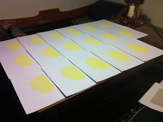
 I'm starting out with seventeen prints on this one! I decided to do twice as many as usually, because there will be over twice as many colours (plus the last sheet of paper in the book, for good measure). That's my table covered with printmaking goodness. And here is the first colour:

I decided not to print every single corner because there simply isn't going to be any yellow showing, and I figure it will be easier later on if I don't have to perfectly line up the really dark colours on top of it, and still have some bright yellow poking through to ruin the whole thing. So I'm going to easy route (I hope). The nice thing about doing so many layers is that I don't feel I have to get a perfect print every time, because chances are most of it will be covered or obscured, so no one colour is the linchpin of the entire piece. Takes the pressure off a little.

Speaking of being glad there are many layers to come, look what I did to this print:

I noticed that there was a little build up of ink of the corner of the last print, so I grabbed a spare bit of paper and blotted it. Without thinking, it was written on with pencil, and that transferred into the ink, and from there on to this print. No big deal, it won't be seen by the time the rest of the layers are on, but certainly and amusing and potentially useful bit of information. For future reference?

The second layer was a little bit of bright green. It's only going to show up on one book in the final print, so, again, I only put it on a small section:


I'd like to give one of these away when I'm done! Leave a comment on any (or all, for extra entries) of the posts related to this piece for an entry. I'm going to draw it when it's finished.

Tuesday, December 27, 2011

Books Reduction Lino Print - Idea and Contest

I took a bunch of photos of old books a few months ago, and took one to separate into colours for a reduction lino print:


It's eleven colours. Eleven! That's ridiculous. But hey, the one with only four colours worked out well enough, so I'll just jump ahead to something way way more complicated instead of maybe taking it easy and doing one with, say, six or something. Sigh... oh well, that's how I roll. This should be interesting. I'm going to start with more prints, because I want to have at least six prints that turn out in the end, and if I only have six good ones out of eight (that I started printing) on a four colour reduction, I'll need to start with at least twice on this one, and be a lot more careful!

I have high hopes for this one, and since it's Christmas and I'm feeling warm and fuzzy toward the world, I'm going to give one away! Just leave a comment below this, or any of the posts about this lino cut (each one gets an entry). If you want extra entries, let me know that you've mentioned this on your blog.

Monday, December 26, 2011

Armillary Sphere - Last Two Colours

This was such an easy project, with only four colours total! Of course, I had to go and rush the third one, so I didn't get the registration right on a few because I was going too fast. grrrrrr. Oh well, I started with eight and will still have five or six good ones once I look over them to see how they turn out.


When I was mixing the last colour I discovered that the yellow ink actually has a fair bit of white in it, and made the black grey instead of turning it brownish. I ended up making it fairly purple in the end, which looked more like what my monitor did to the dark brown of the original colour separation I did when planning this.


I'm pretty happy about how it turned out. For the most part I cut everything where it's supposed to be, and I like the blue. It's still a learning print, but not too bad overall.

Saturday, December 24, 2011

Armillary Sphere - First Two Colours

First of all, apologies for the crappy photo. I really am going to buy a nice scanner one of these days. I started doing the colours for the armillary sphere print, was was surprisingly easy. Yay! I got an easy carve lino block, and it has proved much less frustrating, and less painful, on my wrists. I could even still see all the pencil marks once I'd washed off the first layer of ink, which made my life considerably easier when it came to carving in the second colour. Here they are:


Friday, December 23, 2011

Armillary Sphere - Idea

 Reduction linos - right. That things I tried doing a couple times a few month ago and haven't touched since? Well, I'm on Christmas vacation now and pulling out a bunch of stuff I haven't had time for and generally puttering about my condo doing whatever occurs to. Peppermint martini this afternoon? Hells yes. Anyway... I was looking through the photos I worked on last summer for a new print. I had taken a few and separated the colours so they would be easy to carve. I choose this photo because it had the least amount of layers, and therefore, would be the easier not to screw up. This is what it looked like though:

Which is really pretty boring. So I played around with the colours, and finally decided on changing the middle brown to a nice blue:

and deleting some of the detail at the bottom. Very nice! I didn't even change the dark brown, but I like how it seems to look a little purple against the blue and yellow. Should be a much more interesting print this way.

Monday, December 19, 2011

Laughing Kids - Finished!

 Well, I'm finally done school, and that gives me a whole lot of free time to start drawing again, and to get a few posts up! I finished this a couple of weeks ago, but haven't been very good about posting things. I'm quite pleased with how it turned out. I think it has a lot of energy. Not to mention, I finally got everyone looking right, so that's a big bonus. It's been sent off and I hope will make someone very happy for Christmas.

Here's a couple close-ups of the faces:


Thursday, November 24, 2011

Laughing Kids - Almost There


Well, a few layers and corrections later, and this one is turning out pretty well. I've started adding some colour into the shadows, because I want there to be quite a lot going on, given that the subject is high energy, even if the original photo was more neutral. Also, I think I've got the boy's face sorted out pretty well, he's not looking squashed anymore:


And then here's a photo with another layer, and starting to build up the background a bit more. I've also toned down that orange shirt a bit, because I was finding it too distracting in the overall composition. First a added blue and purple, but that really muddied it up too much, so I ended up blending in some light grey, and that really did the trick.


Sunday, November 20, 2011

Laughing Kids - Corrections

I left you on the last post with a cliffhanger about how I'd destroyed the boys face in my pastel. I've been working and fidgeting with it for the past few days, and here's where I've gotten so far:


Followed by a few layers to flesh everything out, and I'm getting close:


I still have a fair bit to do, including finding a better spot to take a picture, because I can't get the colours right for you here. He's coming along fairly well now, and I think another day or so and I'll have it.

Thursday, November 17, 2011

Laughing Kids - Underpainting

A friend of mine asked me to do a picture of he and his sister wen they were little. It's a really cute photo, and they've both got big grins of their faces. Should be a fun picture, with lots of bright colours. Here are the first few shots.


I choose a nice dark paper, because I want to colours to really stand out. It is a lot darker than I've done portraits on, though, so it might get interesting. I'm starting out with darker colours, then lightening as I go.


Ok, now the problem. I don't know if it's the different technique I'm using, or I'm just getting over confident in my pastel abilities, but look what I did to to the poor boy on the next layer:


Yeah, he looks a little squashed. This should be interesting.

Wednesday, November 9, 2011

Rudiments - Drapery 1


I finally realized on Monday that my Saturday drawing session had long passed and I should get myself in gear. So I grabbed my neglected drawing board and hopped on my bed. Fortunately (?) I hadn't taken very much care when I made it, and everything was nice and wrinkly. Plenty to draw! I'll admit I wasn't 100% focused, so it's not the greatest drawing I've ever done, but helpful nonetheless. I think even a little bit of the different textures can be seen. The next session will involve finishing that front pillow, which has some rather intricate and metallic brocade. I need to find a white pencil crayon first, though, so I can try for the shiny highlights.

Sunday, November 6, 2011

In Flanders Fields - Inside

I had left plenty of room around the full page of the calligraphy I put up in the last post, so it was easy to trim the edges to fit. Then I realized I slightly misunderstood the directions and had to double the amount of folds I had for the book, but thankfully that was easy to do. I ripped all the edges of the flags because I didn't want them to look nice and neat. 

I started glueing everything in place, starting at the bottom strip, and realized by the forth layer that the backing paper was a little small. It was actually a bit big to begin with, but I guess I left more room between the layers than I realized. Thankfully the paper was pure white by this point, so it was easy enough to make that layer a little bit smaller without losing any of the image. The placement on a few of the flags is just a little off at the edges as well. Between all that, and the difficulty I had gluing everything neatly, I've learned that next time it would be best to glue one fold vertically at a time, rather than the full horizontal strips. I think. The glue did tend to get all over the place, and I've already spent a good deal of time scraping it away. None of this is really noticeable, and I'm probably going to keep fixing everything, but I'm anal enough for it to really annoy me.

This is what it looks like flat, which is neat because you can see how the flags were originally part of a larger image.


And here are a few shots of what it looks like in book form:


Saturday, November 5, 2011

In Flanders Fields

Remembrance Day is coming up, so I've begun a book based on John McCrae's poem In Flanders Fields. It seems to me like a bit of an odd thing to make into a book, somehow, but I am in the military, so I guess I just work with what I know. It's going to be a flag book, which I've never made before. The pages/flags will be made up of a this, which is the poem written over and over again in ink, with red ink 'poppies' interspersed. I've used this calligraphy/abstract way of writing a few times, and I love it every time.


Here's a close up. I dropped the red ink onto wet writing so that it would bleed along the letters. I'm not 100% on how it turned out, but once I got some watercolour on the red they looked better, and a lot more like flowers instead of random blobs of ink.

Tuesday, November 1, 2011

Rudiments 1 - The Idea and a Rant


I'll be the first person to admit that this is not the most exciting thing I've ever posted here. It's actually just a quick sketch I did because the class I was in today was very very boring. However, it's here for a good reason. It's one of the first things I've ever drawn in which I focused on the textures and materials of the object, instead of just it's shape. It's a water bottle made out of a matte rubber, somewhat reflective plastic, and a highly reflective clear plastic base. It somewhat astonishes me that I've never really put much effort into drawing textures before, and this seems like a massive oversight in my training. I've also never done a drapery study, and only once a perspective study. Really. Yet I have a BA in Art with Great Distinction.

So I've decided it's time to start remedying this giant oversight in my education, and will start putting aside a certain amount of time every week, probably three hours or so every Saturday, to work on these things.

While I was thinking about this, and coming up with a few things to practise, I googled 'drawing rudiments' to get some ideas. One of the articles I came across, targeted to beginners, talked about how important it was to put 'emotion' in the drawing, and let the 'spirituality' of the artist or drawing or something come through. (Rough paraphrase). How completely ridiculous! Drawing is a skill, just like any other, and it takes hours and hours of practise to know what one is doing. Style will develop with time, and only truly skilled artists will be able to put emotion into a piece of artwork. Forcing this at the beginning, especially for a beginner without basic skills or knowledge, is much more damaging to someone trying to learn what they are doing than it is a learning experience. One must learn the rules before one can break them. Furthermore, this idea perpetuates the myth that art is some kind of mystical practise, and that talent simply descends on a chosen few. This notion keeps non-artists, and potential art-lovers at a distance, and blames the viewer for not appreciating the artwork instead of ever entertaining the notion that the art itself might be to blame. Art is not made only for the chosen few who know the right words, wear the funny clothes, and raid the buffet at a gallery opening. It would be fairer to the viewer, to the veteran artists who have put the effort in, and to potential artists to admit that art is just a skill, and like anything else, will take a very long and frustrating time to master. And then show them the Sistine Chapel so they can see that it will be worth it.

Monday, October 31, 2011

The Sketchbook Project - Cityscape


I'm mining another old sketch/style for my newest page. I've done a couple of sketches, and a painting based on Al Hirschfeld's style in the Rhapsody in Blue sequence in Fantastia 2000. I think it lends itself well to how I'm doing all Sketchbook pages, especially the background buildings that are jut windows - the darker parts around the outline really bring them out.

Tuesday, October 25, 2011

Life Drawing Session - Procrastination

I find I'm never as creative as I am when I should be doing homework. Last night I really, really needed to be working on a paper. I decided to draw instead. It's still a good use of my time, I could have been watching TV, after all. Oh wait, I watched all of Being Human series 3 too (my god Aiden Turner is beautiful). hmmm, getting distracted again.... Point is, I did a few little studies of the type I should really make a point of doing more often in order to keep my skills sharp. 

Looking at all three I can tell my interest was not holding until the end, though. The first started out as a careful, academic study, the second one is much closer to my typical scribbly style, and the third is barely started, though I like outline look as well. I may try a few studies in which I concentrate on a few simple lines, because it's so hard to do right.


Monday, October 24, 2011

The Sketchbook Project - Retro Circles


I couldn't decide what to do for the next page of my sketchbook, so I did a Google images search for 'abstract styles' and used the first one that appealed to me - a retro poster with rays and circles. It was kind of fun, and unusual for me, so it seemed like a good fit. I started out doing the writing along the rays, but for some reason forgot to adjust the angle as I moved, so it ended up perpendicular at the end. That's OK, it was kind of a nifty composition experiment anyway. I d feel like it's missing something, though. 

Saturday, October 22, 2011

Graphic Novel tests

I've been playing around with an idea for a graphic novel with a writer I work with, and have come up with a few ways to draw our hero. I'm trying to find a good style for the story, which will be set in the 40s, and stars an ex-RCAF navigator turned private detective. Or something like that. Here are some incarnations as I'm working my way towards the final style.


Friday, October 21, 2011

The Sketchbook Project - Cubismish


I sat down last night to try and figure out my next sketchbook page, and started thinking about a few sketches I did years ago in a sort Cubism-inspired style, where I basically drew a bunch of lines, then put different bits of whatever I was drawing in the spaces, like this apple:


So I did exactly the same thing and picked up the first thing I saw to draw - a little globe. I think it turned out very well.

Wednesday, October 12, 2011

Shadows


I finally got to work after a long weekend of being lazy, unmotivated, and full of turkey. I'm not normally much for abstract pieces, but I loved the shape of this so much I couldn't resist. It's the silhouette of a bracket I ordered a couple of weeks ago. The pair are sitting on the kitchen counter waiting to become my entry closet, and I saw their shadow one evening and loved the shape and the way  it blurred the further out it got. So I replicated the effect with my little light and traced out the pattern:


I think it looks great, though I may yet darken the top area.

Available on Etsy: http://www.etsy.com/listing/83760780/art-nouveau-silhouette

Friday, October 7, 2011

A Night at the Circus - Take a Bow


This is Round Two of the little sketches/experiments I've done with my circus-themed photos. After the feedback I got that the first one was a little difficult to read I tried a different technique. I used the masking fluid more as a safety to keep certain areas pure, rather than as the negative space and only image. The colours were used for mid-tones and modelling, rather than all blending together in an abstract field to highlight the white. The black was used almost exclusively for the shadows, again, instead of simply blending into the colour (at least, not as much as the first painting).

I'm not totally sold on this version. I think in some ways it's an improvement. It's certainly easier to see the figure. One the other hand I just don't think it's as interesting. Of course, it doesn't help that I got called away in the middle and the waterproof ink dried in the middle, making it very stripey because I couldn't blend it afterward. Still, that's hardly the big problem here.