Wednesday, June 30, 2010

Words & Letters - Papercut layer

Here is the second layer of the book. Over the letters I cut out just the capitals (not the lines and patterns), and to frame the words I did a few of the circles and lines, but very simplified and only around the outside.

The second half of the book. I like the 'Q' because of the positive/negative thing going on with the stem. I did the same thing with a few of the circles, or wherever the letters go outside the square.

Like in this close-up!


And in other news, the winner of last week's giveaway is Velma! Congratulations!

Words & Letters - a smallish art book. No, really

I'm staring another art book, but this one is going to be a pretty small project. It's the one that lead to this piece as I was planning it out. It will be another star book, all the black and white.

I wanted to do something on old book pages, and really like the Roman alphabets with all the lines and circles around them showing to make the letters. However, I didn't want to just to an alphabet book. So I decided to but some quotes in with them. I was going to just do random quotes about words and writing, kind of like an old sketch I did way way back. I can't it, but here's an abstract (ish) painting based on it, which might give you the idea:

This time around I wanted the quotes to have a bit more coherence. So I tookt he quote I liked most, "Words, words, words" from Hamlet and expanded it to include a few of the lines around it as well.

Close-up of the pages. There is one letter and one quote per layout. This is the back layer, and the others will be cut-out so you can see into this one. It's based on a square, because the letters are. The quote is smooshed into the same shaped. I didn't really use calligraphy for the quote, what I did was trace the outline of the letters and scribble inside to (mostly) fill them in. I love it with a little 'sketch'-like quality to it, rather than a more polished finished product.

When the separate pages where done I threw them all on the floor and decided on the order they would go in (see the top photo). The quotes and alphabet to go in order, but I didn't want them to simply alternate (letter on the left, quote on the right) so I played with it a bit until I was happy.

Then they all got cut out and glued to nice stiff paper to finish it off. I ripped the 'H' when I was putting it on, but that turned out to be a good thing because it was a boring letter and I replaced it with a more intricate 'K' instead.

A Leftovers Cover

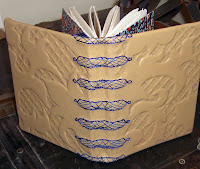
Add ImageMany months ago I was browsing around on Etsy and found some Rhonda's books that looked like they were made of two separate pieces of leather. That seemed like a great way to do two-tone books, or get rid of some old leather. So last week when I was again actively looking to use up some scraps I remembered my brilliant plan and did a bit of reverse engineering and adapting to come up with this binding.

Of course after I was done I realized that I probably could have looked at her blog for more information about it, and there was tonnes. They're called Crossed-Structure Bindings, and were invented by Carmencho Arregui, who also has a very informative website.

Nevertheless, I'm happy with what I came up with on my own. I think it works better for my purposes, since the proper version actually would have used more, rather than less, leather. But now that I've found more things to play with and adapt, it should be fun to have all that extra information!


ps. I missed Canada Day due to some computer problems, and of course, fireworks! But here's something for a little late celebration. Happy July Long!

Monday, June 28, 2010

My new favourite binding

I'm making a whole bunch of books to get ready for the Beads Paper Water Gift Fair this November, not to mention the Hotel Sask (they'll need more for Christmas too!). I want to get as many nice, simple, books as I can first as basic stock before I get caught up in the stranger, time-consuming ones. On top of that, I'm making myself use up all the supplies I have (as much as possible) before I get anything new. So, leather books first, then on to Coptic and the like to get rid of all the paper I have.

I came up with this way of binding some of the softcover leather books. I will likely make a few of these because the ribbon (and that can easily be suede or something else, to get a different look) both decorates the spine and closes the book in one easy step, and there's very little hole-punching/sewing because there are only three lines of it! But don't worry, the paper still stays in place very well.

He Wishes for the Cloths of Heaven - all put together (well, almost)

So here we are, at the end of a very frustrating project. If you read my other posts about it, you know this already, but nothing seemed to go quite right on this one, and I'm glad I'm rid of it. Which is not really the attitude to have about these things, but still, it happens sometimes.

Here is the cover. I think I will end up changing this, or at least the ribbon, at some point. I had no idea what to do for it. I'm not a very good embroidered so I didn't really want to do that. It worked fine for "The Tell-Tale Heart" because that was supposed to be messy. But this should look nice. Also, it isn't seen when it's open, and will probably never be displayed closed, so I don't want anything elaborate. Leather would have been much too thick because it would be bulky when it closed. Any papers I tired looked bad against the fancy calligraphy. So I just went for some silk. Other than that... yeah, I have no idea what I really want here. Maybe I'll take it with me to the fabric store and see if I can find anything that doesn't look stupid with it.

With the embroidery on the edges. I used silk thread in grey and purple, in a sort of twisted chain stitch. It blends in and compliments and looks terrific all at the same time. At least one thing went right!

The cover when it's on display.

Yeah, I think I'm going to rip it off. In fact I know I will. I'm going to look for something in ivory and gold.

He Wishes for the Cloths of Heaven - background

This is the layer going behind the poem. It has the title and author. It was done in masking fluid with a really thick nib I've never really been able to use but work wonderfully for this. On top of that went a few layers of calligraphy and ink to darken it up. I found it kind of difficult getting the look I wanted with this. It had to be lighter and simpler than the poem layer, but it just never quite looked like I'd done enough. I guess the poem was just too complicated and full of colour. It might look simple, but it's actually very very involved and that makes it difficult to work with if it's not totally plain white, really. Still, turned out all right.

Here's a closeup. I like it. Though after I finished I wondered why I hadn''t done it in the same font as the poem. Old habits, I guess.

Sunday, June 27, 2010

My 100th Post! and a giveaway.

Congratulations to me, I am still writing these things up! Actually, I find I enjoy blogging and it makes me work more consistently so that I will have something to say. Since I made it to 100 and that's a big round number I decided to skip ahead in my projects a little bit and make something new.

This is an outgrowth of the book I'm going to start working on as soon as He Wishes for the Cloths of Heaven is done. I love LOVE the old letters with the lines around them showing how they are formed. I always have. I think it's the Steampunk in me.

This piece is made from three layers. The cutout letters, the cutout lines, and as a background, an old book page. They have matte board in between to seperate and define the different pieces. I think it turned out really great and I'm looking forward to making more!

Here's a close-up so you can see how they're on different levels.

If you can't wait for the contest, you can buy it in my Etsy shop.

If you want to win it instead (sorry, no frame, though), just leave a comment to enter your name! And if you want to link to this blog (because this is all about shameless self-promotion), let me know you posted something about it and I'll give you two more entries. I'll draw for it in one week. So check back Sunday!

Friday, June 25, 2010

He Wishes for the Cloths of Heaven - before and after

I finished the last couple panels of calligraphy, and here is how it looked. Then I decided to try and blend the second paper's background into the first a little more, and stupidly started layering ink/watercolour on top of the writing. Which of course smeared it all over the place. I mean, it's glittery. But I sort of liked it, especially since the whole long panel seemed to change as it got to the end anyway, so I ran with it. I put washes of gold over the last bit, and after all that was dry I redid the calligraphy on top where it had gotten washed out.

This is what it looks like all together, so you can sort of see the progression.

And here's a close-up of the last two panels now.

Thursday, June 24, 2010

He Wishes for the Cloths of Heaven - my sense of spacing leaves something to be desired

First, sorry about the painter's tape in the corner. But you can see the rest just fine. For instance, you can probably see the missing 's' at the end of the line. Yup, my ability to keep the spacing correct remains as good as ever. It started out too tight, and I overcompensated and ran out of room. The last letter will have to be on the next panel and second sheet of paper. That should look fine for now, but I'll have to figure out how to get the embroidery over top to connect the papers without disturbing the lettering, or being overly conspicuous.

Monday, June 21, 2010

He Wishes for the Cloths of Heaven - another line and more paper

So here's another panel. Nothing much to say about it, really. It looks like the rest of them. But the overall effect will be cool! In proper news, I made some more paper to make up for my terrible math mistake, and it looks pretty close to the original:

I'm not sure how to join them, since it will be the only interuption. Perhaps I will embroider the pages after all? Maybe along the outside edge of each one.

Sunday, June 20, 2010

He Wishes for the Cloths of Heaven - I knew something like this was going to happen


Here are the next two lines of He Wishes for The Cloths of Heaven, and just as I was thinking to myself that I really liked where this was going, and being impressed that I was almost done, as there were only two panels left of paper to write on I realized something was not quite right. There are four lines of poem left. So despite my measurements and math and template and doing all of this three times before starting, I haven't even managed to count to eight correctly. Unbelievable. So now I have to somehow make more of this background paper to match the original. Which took many different coloured layers and about two hours. Not cool.

Saturday, June 19, 2010

He Wishes for the Cloths of Heaven - second line

This is the second line, and looking pretty good. I taped the printout with the spacing directly above where I was copying, so it was easier to copy this time around. I made the 'o's small to keep with the previous line. It's a bit wobbly, but I think when it's all put together no one will look that closely.

Friday, June 18, 2010

I Haven't Done This in Awhile

It's been a few, well, many months, since I've just a plain book with a soft cover, so here I am. I'm getting ready for a big craft show in November, so I need to start stocking up, and these don't take too long and are nice and basic, so I'm starting here. I picked out a whole bunch of papers/leathers and now I'm waiting for my thread to arrive so I can get started! This was the only one I had that I wanted with a neutral, so it went first..

Kind of a Steampunk type feel to it. I love Steampunk.

Inside. I love marbled paper! This is from Rhonda of My Marbled Papers.

He Wishes for the Cloths of Heaven - a first section

I'm having trouble with this project because I naturally make things more complicated and what I really want is to make something simple and fairly quick.

As I haven't done one of these books I started by making a little mock-up of the different sections that would go into it. The size is basically determined by the large paper with the calilgraphy on it, because I want it in one long, uninterrupted strip. After I made this I realized there will be much less visible of the middle and back layers, so I'm going to make the details, well, less detail, and instead simple and broad so that they can be seen with ease.

This is how I'm working on the calligraphy. I don't want to put too many pencil marks on the paper, so I made a background with a whole bunch of angled lines to follow instead. The line I'm copying is just above. I spaced everything out with Photoshop (yup, took the easy way out on that one) so it would fit right.

And here's the first line. It's really hard to photograph this, and it doesn't really scan. There is much detail showing up on the photo, in the background, then is really there. But still, I think you get the idea. I like how it turned out. I didn't follow my layout very well and had to smoosh in the 'o's and last 's', but other than that it looks ok. I also looked at my little sketches after I started, and realized I didn't actually want all the lines unbroken, because some of them would have been cool with the the swirls on the actual line, rather than just around them. I guess we'll save that for the next lines.

Tuesday, June 15, 2010

Jess Blowing Bubbles

I'm experimenting again. I pulled out an old photo of my friend Jess. I decided to go for a bit of a different look than normal, play up the colours, and do something maybe a bit surreal.

The original photo. I simplified the background.

Step One. I did an ink outline because I like bold edges, especially when so much of the finished drawing will end up covered in reflective, distorting bubbles. I put watercolour over top, which I made a little bolder because of the coming layers. The colours didn't follow any particular scheme because I'd decided against a realistic skin colour. Then I covered it with conte and pastel.

He Wishes for the Cloths of Heaven - a new, smaller project


He Wishes for the Cloths of Heaven

Had I the heavens' embroidered cloths,
Enwrought with golden and silver light,
The blue and the dim and the dark cloths
Of night and light and the half-light,
I would spread the cloths under your feet:
But I, being poor, have only my dreams;
I have spread my dreams under your feet;
Tread softly, because you tread on my dreams.

--William Butler Yeats

Welcome to my next calligraphy book project. I like how The Tell-Tale Heart turned out, so I'm having another go. Only this time instead of a story I'm only doing a very short poem. I want to keep this well under two months! I also want to try a different type of book. I've never really done much in the way of different types of books, and it's about time. So this one will be a star book, a bit like this:

This star ornament is from fellow Bookbinding Etsy Street Team member KupoKiley, and you can find it here.

I've been try to work out the look and materials and different layers etc. I'm finding it a bit hard to get a handle on exactly what I want to do with it. This sketch is the closest I've come to an actual plan:

I have a basic feel I want to achieve, sort of a dark Art Nouveau look, a bit Gothic and Edwardian filigree and things like that. The trouble is finding paper - nice dark blue paper seems hard to come by, which makes it hard to stick with the 'night' theme, and I want heavy paper to do cutouts that can then stand up on display. Plus, it's three dimensional, so all the paper has to be as pretty on the reverse side as the front. I will probably end up making or glueing most of it, I'm kind of thinking. So much for this being a simple project! I choose a short poem, so some part of me is compensating by making everything else more complicated.

This is the paper for the outside layer, the one that will have the actual poem on it. It's my favourite technique - layers of calligraphy (the poem, of course) over and over until it's unreadable. I also put a couple of washes on top to give a more uniform background for the proper calligraphy. I'm going to use gold gouache on top with loads of little flourishes. Behind that will be a few layers of cut out writing, and maybe some transparent paper if it fits with the them. The back layer will have the title and author, done in masking fluid with this type of calligraphy on top - kind of the exact reverse of this page. Or something. We'll see what I figure out!

Sunday, June 13, 2010

A Little Purple Luxury

I am once again low on every type of supply but decorative paper, so I made a fancy and luxurious book using the one thing I do have at the moment. This one took a very long time to put togetherer. The back stitching is all in silk thread, and then there's all the embossed detail under the leather. I'm really loving that technique. I think it adds so much to the cover, and while it can be time consuming, is really not very difficult. I did two layers to get the effect I wanted, the lattice pattern (to match the embroidery) and the damask on top, to make sure the edges stood out.

On the inside I used a very rich textured purple (same type of paper as the red in The Tell-Tale Heart) that was very annoying to rip and I made a big mess of my sheet. I hope there's enough for another project, but I really did a number on it. The other paper is a really nice Japanese one I just picked up. I wanted something a little over-the-top that just pops whenever you open the book.

This one is for sale on Etsy.

Wednesday, June 9, 2010

The Tell-Tale Heart - ok, I lied, but now it's really finished

Following a critique I got back of my Tell-Tell Heart I decided to listen to their very good advice, and try to antique the cover, as just didn't quite fit with the antiqued look of the inside pages. So I put some paint on it. Which not only added the needed age, but also brought out all the detail in the shapes! I love it!

Tuesday, June 8, 2010

The Moral of the Game

My friend Caryn (of kite fame) bought the painting I did of her. yay! And when she sent me the cheque for it she included some terrific old board games she'd found, just in case I wanted to use them. Which of course I did. They aren't really board games, though, they're on very thin flexible cardboard, which is even better because it's easy to wrap around the book board.

I'm sending one back with the painting just as soon as I figure out the best way to ship something so heavy.

The Snakes and Ladders games I used for the cover is highly moralistic. With 'penitence' leading up to 'grace' and 'disobedience' down to 'disgrace' and the like. It's kind of amusing. When I was little I actually had a giant plastic version of this exact game, though I don't remember is it had the words.

The inside paper is bright red and blue, to go with the squares of the game. I changed the usual way I do the back leather pieces into smaller strips to go with the square outlines. This photo is of the back, and I like what I did with the strap that holds it together. Instead of sewing down the actual strap I put another leather strip over top and sewed it instead. It matches everything better this way, I think.

The leather I was using was just scraps, and the strap holding it together at the front had an angled corner. I though it kind of added something, so I just left it.

Monday, June 7, 2010

A Real Comic

All right, so because I've been doing a few pictures in a graphic novel style I thought it was maybe about time I actually drew a comic figure. And I do love Batman, so I had a go. I really really love the background. It was just an afterthought, but it turned out great. Or at least it will when I put a bit of effort into the layout of it rather than just following the outline of the figure.

Over all I'm pleased with how it turned out. I think, though, I would like to play with it a bit more. I'm going to working with the positive/negative spaces a bit more (especially reversing them), get some starker contrasts, and a slightly more traditional outline. I'm also going to use a soft brush to put on the masking fluid instead of a pen, this has just a few too many sharp tiny lines. I like finished drawings that retain a very sketch-like appearance, but this just isn't quite polished enough.

This was where it started. I just did a very faint pen outline and erased all the pencil lines (learning from my self-portrait!). Then I put a whole bunch of masking fluid on. Next time I'm going to work up a nice strong outline, especially where the light is supposed to be hitting, and then use the masking fluid.

Then I covered it with scribbles, ink, navy and brown watercolour, and drops of ink. This is before the masking fluid came off. After I removed it I softened some of the white areas, strengthened some edges, dropped more ink on it, and added a bit of white charcoal.